There’s nothing like a good joke
You’ve probably seen the 2016 US election results plotted by county, as in this via Brilliant Maps
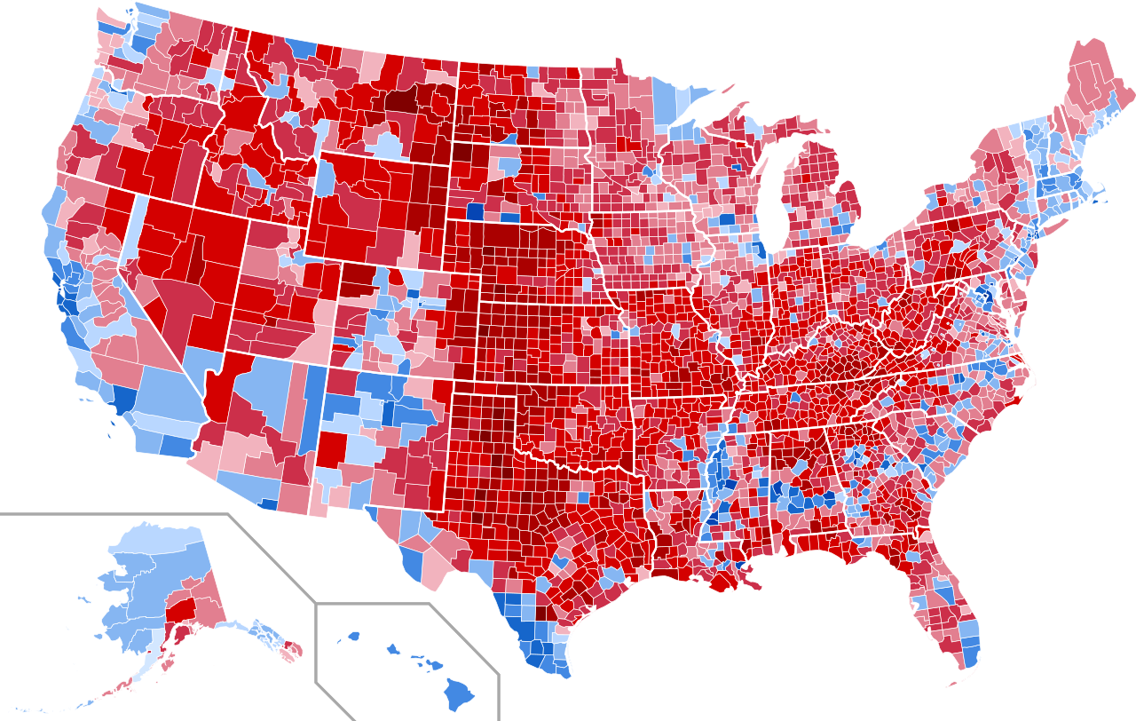
It’s not ideal, because large, relatively empty counties take up a lot of space but represent relatively few people. It’s still informative: you can see, for example, that urban voters tended to support Clinton even in Texas. There are also interesting blue patches in rural areas that you might need an atlas to understand.
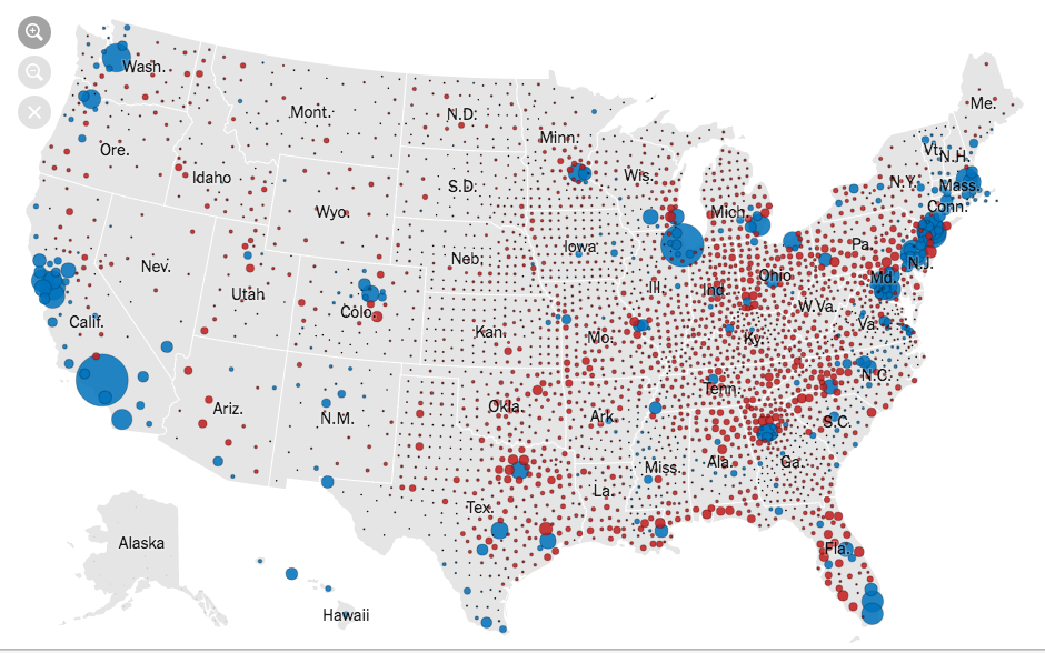
For most purposes, it’s better to try to show the votes, such as this from the New York Times, where the circle area is proportional to the lead in votes
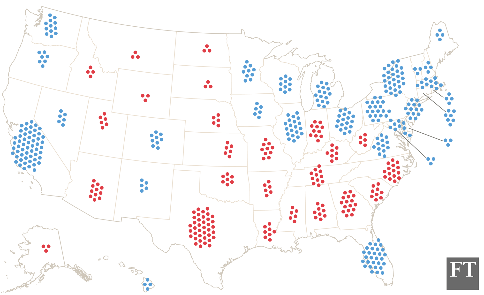
You might want something that shows the Electoral College votes, since those are what actually determines the results, like this by Tom Pearson for the Financial Times
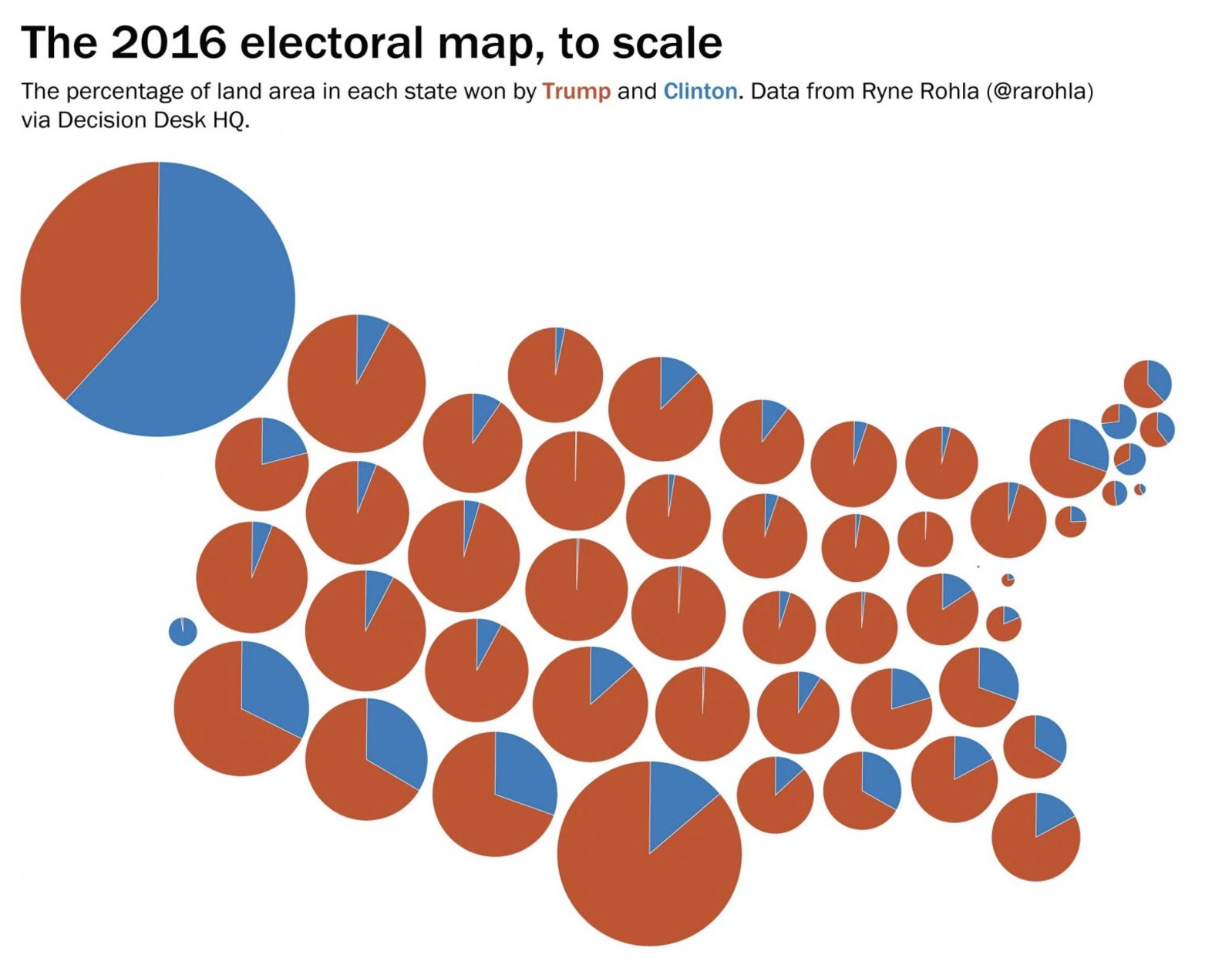
Or, you might like pie charts, such as this one from Lisa Charlotte Rost
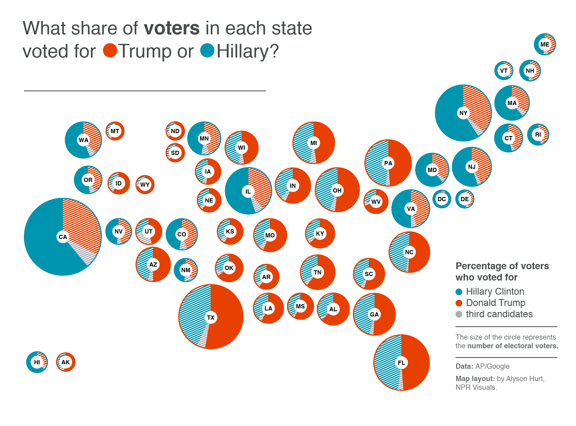
These all try to improve on the simple county map by showing votes — people — rather than land. The NYT one is more complex than the straightforward map; the other two are simpler but still informative.
Or, you could simplify the county map in another way. You could remove all the spatial information from within states — collecting the ‘blue’ land into one wedge and the ‘red’ land into another — and not add anything. You might do this as a joke, to comment on the President’s use of the simple county map
The problem with the Internet, though, is that people might take it seriously. It’s not completely clear whether Chris Cillizza was just trolling, but a lot of people sure seem to take his reposting of it seriously.
Recent comments