May 4, 2014

False, but not misleading

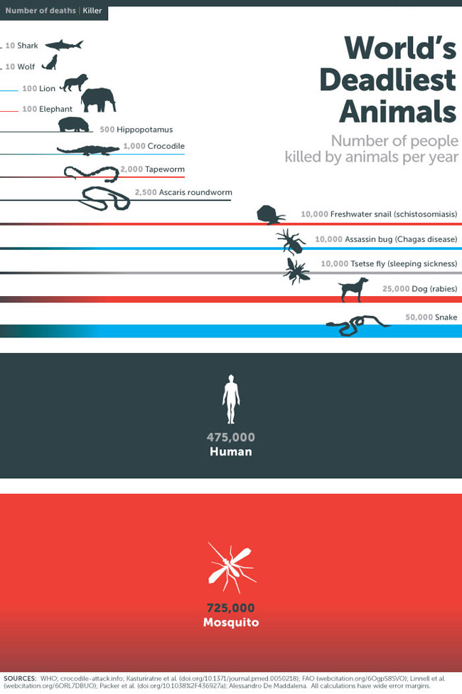
An infographic tweeted by Bill Gates recently on the world’s deadliest animals
00


He’s trying to make the point that malaria is a really big deal, killing more people than human violence, which is true, and which is the impression from the infographic, so it’s not misleading in that sense.

However, mosquitos don’t rend people limb from limb. The mosquito deaths are due to mosquitos infecting people with malaria parasites. The human deaths, however, are just directly due to violence. If  he’d included deaths due to human-human transmission of infection (influenza, tuberculosis, HIV, …), humans would easily be at the top of the list again.

May 3, 2014

Optimising the for the wrong goal

From Cathy O’Neill, at mathbabe.org

By contrast, let’s think about how most big data models work. They take historical information about successes and failures and automate them – rather than challenging their past definition of success, and making it deliberately fair, they are if anything codifying their discriminatory practices in code.

That is, data mining approaches to making decisions are blind to the prejudices attached to characteristics such as gender, ethnicity, age, so they will readily look at historical data, note that women (gays, immigrants, Maori, older people) haven’t been successful in positions like this in the past, and fail to wonder why.

White House report: ‘Big Data’

There’s a new report “Big Data: Seizing Opportunities, Preserving Values” from the Office of the President (of the USA).  Here’s part of the conclusion (there are detailed recommendations as well)

Big data tools offer astonishing and powerful opportunities to unlock previously inaccessible insights from new and existing data sets. Big data can fuel developments and discoveries in health care and education, in agriculture and energy use, and in how businesses organize their supply chains and monitor their equipment. Big data holds the potential to streamline the provision of public services, increase the efficient use of taxpayer dollars at every level of government, and substantially strengthen national security. The promise of big data requires government data be viewed as a national resource and be responsibly made available to those who can derive social value from it. It also presents the opportunity to shape the next generation of computational tools and technologies that will in turn drive further innovation.

Big data also introduces many quandaries. By their very nature, many of the sensor technologies deployed on our phones and in our homes, offices, and on lampposts and rooftops across our cities are collecting more and more information. Continuing advances in analytics provide incentives to collect as much data as possible not only for today’s uses but also for potential later uses. Technologically speaking, this is driving data collection to become functionally ubiquitous and permanent, allowing the digital traces we leave behind to be collected, analyzed, and assembled to reveal a surprising number of things about ourselves and our lives. These developments challenge longstanding notions of privacy and raise questions about the “notice and consent” framework, by which a user gives initial permission for their data to be collected. But these trends need not prevent creating ways for people to participate in the treatment and management of their information.

You can also read comments on the report by danah boyd, and the conference report and videos from her conference’The Social, Cultural & Ethical Dimensions of “Big Data”‘ are now online.

The all-purpose ordinal bar chart

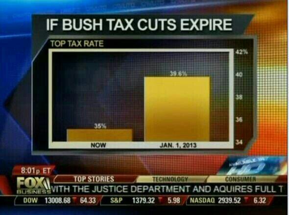
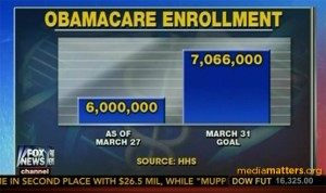
Edward Tufte coined the phrase ‘the Pravda school of ordinal graphics’, reminding us that numbers have a magnitude as well as a direction.  Nowadays, he might have named the problem for  Fox News.

I wrote about this one last month

obamacareenrollment-fncchart-300x178

Today’s (historical) effort, via Ben Atkinson

Bmo62lrCUAEXZqa


Interestingly, although they could use exactly the same barchart every time, they don’t.  The Obamacare chart representing the data ratio  7066/6000 = 1.17 by a height ratio of  2.8; the tax cut chart represents the very similar data ratio 36.9/35 = 1.13 by a height ratio of 5.

“Waste, Fraud, and Abuse” is a common slogan for cutting government spending. Here, the fraud and abuse is obvious in the bar charts, but I hadn’t realised the extent of wasted effort that must go into redrawing it each time.


May 2, 2014

Animal testing

Labour want to prevent animal testing of legal highs. That’s a reasonable position. They are quoted by the Herald as saying “there is no ethical basis for testing legal highs on animals”. That’s a completely unreasonable position: testing on animals prevents harm to humans, and the fact you don’t agree with something doesn’t mean it lacks an ethical basis.

More important is their proposed legislation on this issue, with the key clause

Notwithstanding anything in the Psychoactive Substances Act 2013, no animal shall be used in research or testing for the purpose of gaining approval for any psychoactive substance as defined in section 9 of the Psychoactive Substances Act 2013.”

Assuming that the testing is done overseas, which seems to be National’s expectation, this legislation wouldn’t prevent animal use in testing.  The time when a drug dealer would want to use animals in testing is for initial toxicity: does the new drug cause liver or kidney damage, or have obvious long-term neurological effects that might reduce your customer base unduly.  The animal data wouldn’t be sufficient on their own, because there’s some variation between species, especially in side-effects mediated by the immune system (don’t Google “Stevens-Johnson syndrome” while you’re eating). But animal data would be relevant, and many plausible candidates for therapeutic medications fail early in development because of this sort of toxicity.

Whether animals were used for toxicity testing or not, it would still be necessary to test in humans to find the appropriate dose and the psychoactive effects in people. Depending on the regulations, it might well also be necessary to test moderate overdoses in humans — especially as it appears most of the adverse effects of the synthetic cannabis products are in people taking quite high doses.  That’s the sort of data that might be required in an application for approval of a psychoactive substance.

Labour’s proposal would mean that the animal test data could not be used for gaining approval, and would also mean that the regulations could not require animal data.  But I can’t see much reason it would discourage someone from using animals in initial toxicity testing, which is the only place animal testing would really be relevant.
Mammography ping-pong

Hilda Bastian at Scientific American

It’s like a lot of evidence ping-pong matches. There are teams with strongly held opinions at the table, smashing away at opposing arguments based on different interpretations of the same data.

Meanwhile, women are being advised to go to their doctors if they have questions. And their doctors may be just as swayed by extremist views and no more on top of the science than anyone else.

She explains where the different views  and numbers come from, and why the headlines keep changing.

How to fix academic press releases

In the ‘Rapid Responses’ (aka ‘rabid responses’) section of BMJ, Ben Goldacre has two suggestions:

Firstly, all press releases in all academic journals should be made publicly available online, alongside the academic journal article they relate to, so that everyone can see whether the press release contained misrepresentations or exaggerations. Secondly, all academic journal press releases should give named authors, who take full responsibility for the contents, including at least one significant author from the academic paper itself.

This isn’t a complete fix, because the culpable press releases are as likely to come from universities as journals, but it would be straightforward to implement, moderately effectively, and I can’t think of any good reason not to do it.

Excellent display of sampling error by New York Times


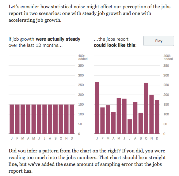
To help with interpreting trends in unemployment, the New York Times has two animated bar charts showing the impact of sampling uncertainty. Here’s a snapshot of one of them (click for the real thing)

jobs


There’s a lot of uncertainty in ‘job growth’ figures from a single month, and a lot more uncertainty in month to month changes in estimates of job growth.

May 1, 2014

Overstating income inequality

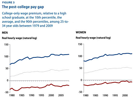
The graph below is from Kevin Drum at Mother Jones, and is supposed to show US income inequality among college graduates (giving the mean and 10th and 90th percentiles) and between college graduates and people with only a high school education (the zero line). The graph is originally from a report by the Center for American Progress (page 7).  Look at the labelling of the y-axis.

blog_college_premium_distribution


As Chad Orzel points out, there is no way these numbers can be right. The blue lines for both men and women cross 100. That should mean the logarithm of the ratio of 90th percentile college-graduate income to high-school graduate income is 100; the top 10% of college graduates would have to earn at least 25 million trillion trillion trillion times more than the average for people with only  a high-school education.

Even in the US, income inequality isn’t that bad.

April 30, 2014

NRL Predictions for Round 9

Team Ratings for Round 9

The basic method is described on my Department home page. I have made some changes to the methodology this year, including shrinking the ratings between seasons.

Here are the team ratings prior to this week’s games, along with the ratings at the start of the season.

Current Rating Rating at Season Start Difference
Roosters 8.71 12.35 -3.60
Sea Eagles 7.52 9.10 -1.60
Bulldogs 6.08 2.46 3.60
Rabbitohs 6.03 5.82 0.20
Cowboys 4.19 6.01 -1.80
Titans 1.67 1.45 0.20
Broncos 0.92 -4.69 5.60
Knights 0.63 5.23 -4.60
Storm 0.15 7.64 -7.50
Panthers -2.77 -2.48 -0.30
Sharks -2.85 2.32 -5.20
Warriors -3.50 -0.72 -2.80
Wests Tigers -5.35 -11.26 5.90
Dragons -5.95 -7.57 1.60
Raiders -6.78 -8.99 2.20
Eels -10.50 -18.45 8.00


Performance So Far

So far there have been 64 matches played, 35 of which were correctly predicted, a success rate of 54.7%.

Here are the predictions for last week’s games.

Game Date Score Prediction Correct
1 Dragons vs. Roosters Apr 25 14 – 34 -7.90 TRUE
2 Storm vs. Warriors Apr 25 10 – 16 11.30 FALSE
3 Broncos vs. Rabbitohs Apr 25 26 – 28 -0.20 TRUE
4 Sharks vs. Panthers Apr 26 24 – 20 4.60 TRUE
5 Cowboys vs. Eels Apr 26 42 – 14 17.10 TRUE
6 Bulldogs vs. Knights Apr 26 16 – 12 11.40 TRUE
7 Sea Eagles vs. Raiders Apr 27 54 – 18 15.10 TRUE
8 Wests Tigers vs. Titans Apr 27 6 – 22 0.50 FALSE


Predictions for Round 9

Here are the predictions for Round 9. The prediction is my estimated expected points difference with a positive margin being a win to the home team, and a negative margin a win to the away team.

Game Date Winner Prediction
1 Roosters vs. Wests Tigers May 09 Roosters 18.60
2 Cowboys vs. Broncos May 09 Cowboys 7.80
3 Warriors vs. Raiders May 10 Warriors 7.80
4 Titans vs. Rabbitohs May 10 Titans 0.10
5 Storm vs. Sea Eagles May 10 Sea Eagles -2.90
6 Knights vs. Panthers May 11 Knights 7.90
7 Dragons vs. Bulldogs May 11 Bulldogs -7.50
8 Eels vs. Sharks May 12 Sharks -3.20