Graphs don’t matter?
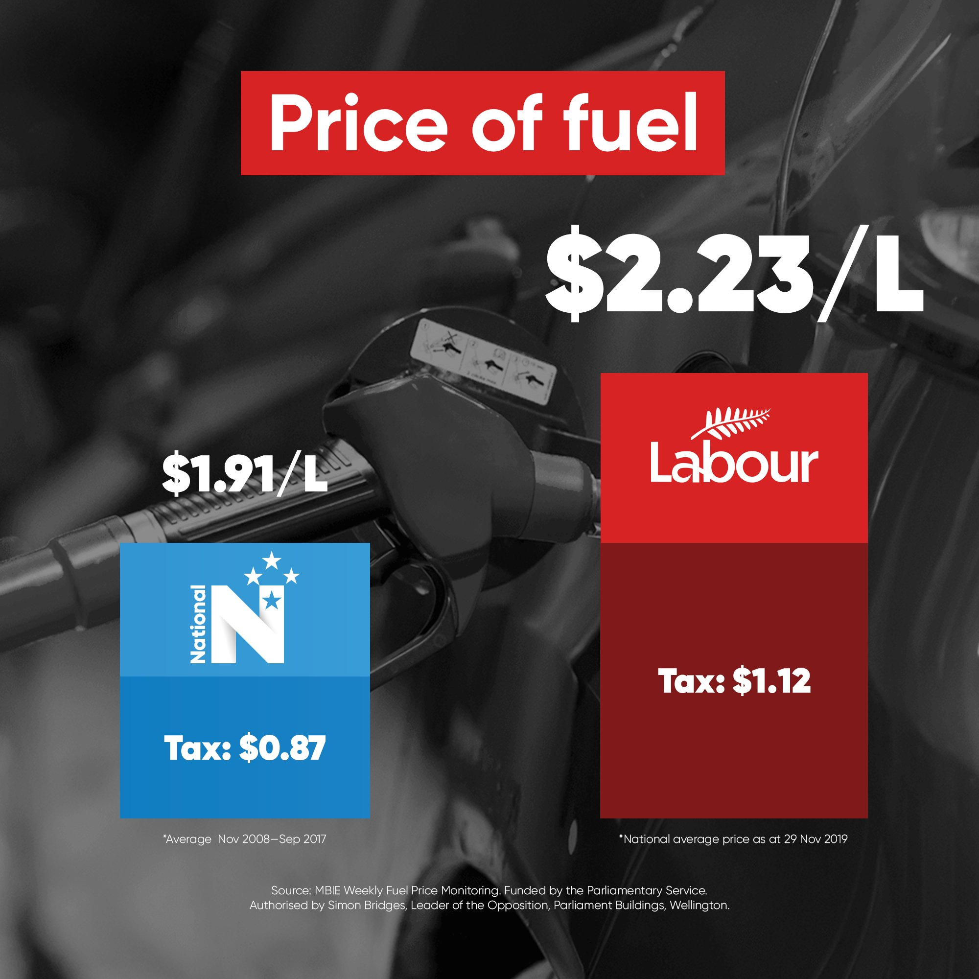
Back in early December, I wrote about a political ad authorised by Simon Bridges, showing the price of fuel.
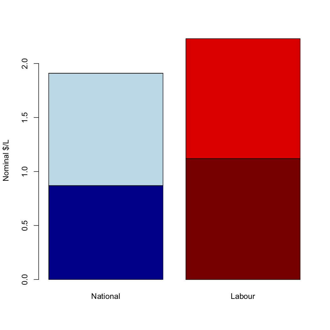
As I said the, the numbers do not remotely match the graph. A graph using those numbers would look more like
Dylan Reeve and other people complained to the Advertising Standards Authority, both about the graph itself and about the choice of numbers, which (in his opinion and mine) was cherrypicked in a misleading way.
The ASA decided (in a split decision) that the graphic was not misleading
The majority said the data displayed was correct which saved the hyperbolic graphic from being misleading, given the political medium used and the principles of advocacy advertising.
I believe this is decision is bad in terms of norms for mainstream political advertising, and that it’s likely to be factually incorrect as to the impact of the graphic.
The cherrypicked numbers are misleading, but they are misleading in a way that is, sadly, routine in political advertising. I’ve written about examples from both parties here since StatsChat started. My starting point for any political advocacy involving numerical comparisons is always that the numbers are likely to be correct as quoted, but chosen to mislead. Given the established norms, I can understand the ASA not wanting to get involved.
The distorted graph, on the other hand, seems to be new. I was genuinely surprised at the extent of the distortion — well beyond common tricks of perspective or false baseline.
If writing the numbers on a misleading graph was enough to stop it being misleading, there would be no point having data graphics. The whole point of data graphics is that they provide a clearer and more forceful impression of the data than just tabulating the numbers. Misleading graphs are misleading.