Posts filed under General (3156)

February 27, 2012

Faster-than-light neutrinos

The faster-than-light neutrinos found at CERN last year were always very likely to be some subtle experimental error, and the odds of this seem to have gone up. Professor Matt Strassler, who actually knows what he is talking about, has some blog posts on the topic, including a very nice graphic that will be familiar to statistics teachers.   The initial news reports last week said the FTL problem had gone away, but that appears not to be true.  What we’re waiting to find out is both what the estimated speed is, and how much uncertainty there is.  It could still be that the results are inconsistent with relativity, and that some other explanation is needed. Or it could be that the uncertainty is larger than the 60 nanosecond timing anomaly, so the results are consistent with relativity. Or, the experiment could have been sufficiently messed up not to tell us anything.   In any case, the real test will come when someone repeats the experiment.

(via: Chad Orzel)


February 25, 2012

It’s not diet ideas we’re short of

You will have noticed the Herald’s ‘Fat list’ of foods yesterday.  University of Otago researchers have come up with another idea for helping people lose weight; a list of foods that are high in calories and low in other nutrients, which aren’t necessary and can be trimmed from your diet. It’s a plausible approach, and while you might have thought the items on the list were obvious, the Herald article makes it clear that they aren’t.

For example, Honey NZ manager Greig Duncan was quoted as saying that honey was “a healthier alternative, and had many other health benefits important for a balanced diet” and that “Because honey is such a natural product, it has a lot of bioactivity which is all part of a natural diet.”   At times like these it is important to remember the immortal words of Mandy Rice-Davies: “Well, he would say that, wouldn’t he?”

The only problem with the NEEDNT list is that we are given no evidence that it actually works as a health intervention.  That is, does handing out copies of this food list to people actually lead to weight loss? Does it work better than giving them a copy of the Atkins diet books, or the CSIRO Prudent Diet, or the South Beach diet?  Or making them take photos of all their food? Or sending them text messages about exercise?  Or any of the other thirteen bazillion weight loss strategies that have been published over the past half-century? This is exactly the sort of public health intervention that needs a randomized trial. It’s more work and less fun than coming up with creative weight-loss ideas, but it has the advantage of actually being useful.

In the mid-70s, the British comedy duet Flanders & Swann wrote a song about dietary fads, called “Food for Thought”.  It’s depressing how little it has dated.

The secret is, think white fish. You can gorge until it hurts.
But just one piece of shortcake and you’ll get your just desserts.


February 23, 2012

Movie review: Moneyball

Moneyball is a semi-biographical film, starring Brad Pitt (Inglorious Basterds, Oceans 11-13, Fight Club), Jonah Hill (Superbad, Knocked Up) and Philip Seymour Hoffman (The Boat That Rocked, Charlie Wilson’s War, Capote), which tells the story of how the Oakland Athletics (better known as the Oakland A’s) reversed their 2001 baseball season performance with a minimal budget and the use of statistics. The film is a dramatisation of Michael Lewis’ 2003 book of the same name.

The film is an account of how Oakland’s general manager Billy Beane (Pitt) hired Yale economics graduate Peter Brand (Hill) as assistant GM to help assemble a new team with a relatively small budget. Small, at the time, was USD 40 million, which is about a third of the money being spent by the top teams in the league.

The story line, from a statistical point of view, is how the data can reveal a different picture from commonly perceived wisdom or prejudice. Beane’s management team is portrayed as a collection of old cronies and hangers-on, whose player selection method is based on “likes”,”dislikes” and rumours about form or injury, without apparent consideration of true performance. Brand, on the other hand, is portrayed as a true baseball geek, and a true geek – being pudgy, nerdy, far from athletic, and happier with a computer than people. It is an odd, stereotypical, choice given that tThe Brand character is fictional. In real life, Brand’s equivalent is Paul DePodesta, who is slim, Harvard (not Yale) educated, and a former baseball player. Brand/DePodesta is an ardent believer in methods developed by baseball historian, writer and statistician Bill James, who is credited as being the first person to use data and statistical methods to analyse player and team performance. James is credited with the term “sabermetrics” which derives from the Society for American Baseball Research (SABR).

As one would expect, the statistical aspects of the the storyline are reduced to playing the percentages. That is, Beane and Brand use the averages to gain competitive advantage over other teams. However, there is a hidden salutary message, in that statistics can only tell us what will happen on average, and says very little about individual events. I liked this because I felt it was a nice message about consideration of variation as well as the mean.

Overall, this was a generally enjoyable movie. It has been nominated for six Academy Awards including Best Picture. Some of the crunch points were lost on me and other members of the audience, because of our unfamiliarity with the rules and structure of a baseball game and the league as a whole. Don’t let this put you off, however. It is a fun David and Goliath-type story and will appeal to all.

Update: The use of fictional character Peter Brand was at Paul DePodesta’s request

February 20, 2012

Stats crimes – we need your help

What do you think are the biggest media/public misunderstandings around statistics? We know that some statistical concepts can be quite hard to understand (and a bit of a challenge to teach); we’d like to compile a list of the top stats misunderstandings so we can accurately focus some media education projects we are planning ….

Some examples that have already been raised:

  • Misunderstanding correlation and causality: All too often causality will be assigned where a study has merely shown a link between two variables.
  • Abuse/misuse of the term “potentially fatal”: While many activities/diseases could possibly result in death, the odds should be considered in the context of a developed country with reasonable health-care.
  • How to know when something is statistically significant and when not.
  •  How to know when you are looking at  “junk” statistics …

Please share your ideas below …

February 19, 2012

Media Watch discusses Stats Chat

This morning’s Radio New Zealand show Media Watch (MP3) covers Thomas’ post on “Tip of the icecube” about the “hundreds of unfit teachers”.

The teachers story starts at 29:47 into the podcast.

February 13, 2012

Big Data in NY Times

 The trouble with seeking a meaningful needle in massive haystacks of data, says Trevor Hastie, a statistics professor at Stanford, is that “many bits of straw look like needles.”

Read more at New York Times.

February 12, 2012

Cycling deaths

The New Zealand Medical Journal has this month published a review of cycling deaths in New Zealand, with the key finding being that “the helmet law has failed in aspects of promoting cycling, safety, health, accident compensation, environmental issues and civil liberties”. This is a bold claim which should be held to high scrutiny.

The journal article (accessible only by subscription, which we at the University of Auckland are fortunate enough to have) is available at the journal’s website, but for those without subscription access can only be to the media reports of it such as on Stuff.

The article itself is jam-packed full of statistics from various sources, so please bear with me.

The most important is probably Table 1, which shows that whereas pedestrian hours have remained relatively constant from 1989 to 2009, cycling hour have decreased by half, and Table 2, which shows that both pedestrian AND cyclist deaths have decreased from 1989 to 2009. Whereas both have gone down by half, the ratio has remained constant at about one quarter. However these statistics are then ‘corrected’ for the number of hours walked or cycled.

Given that cycling hours have significantly decreased by about 50%, as have the number of cycling deaths by 50% over the same period, the stark result is that cycling deaths per hour cycled have remained about constant over the study period – and certainly not evidence that the introduction of the helmet law, or any other event, has increased the accident rate. Something else is going on with pedestrian deaths altogether, which have encouragingly decreased substantially per walking hour over 1989-2009.

However, the author places emphasis on a new statistic – the ratio of cycling to pedestrian deaths. Whereas pedestrian deaths per hour have markedly gone down, cyclist deaths per hour have not. The ratio of the two means that cycling deaths have apparently increased (but importantly, only relative to pedestrian deaths).

The pedestrian deaths trend is actually a red herring, as we could well compare cycling deaths to any number of trends. According to Statistics New Zealand crime has also gone down since 1994. We could equally posit that the number of cycling deaths relative to crimes has increased, but would this be an alarming statistic? (are the criminals using bicycles as getaway vehicles?).

The article is also loaded with other fascinating statistical statements such as “that life years gained by cycling outweighed life years lost in accidents by 20 times”, which I will not cover the moral implications of here, but is that supposed to be some solace?

The key result from this study seems to in fact be that the rate of accidents for pedestrians has declined significantly over the period of the review, which has to be good news, especially prior to correction for population growth. That cycling hours have halved may well reflect increased awareness of the dangers of cycling in New Zealand.

Regardless of that main finding, the article commits one of the deadly sins of statistics, implying causation from correlation. That the helmet law was introduced in 1994 is about as relevant as TV2 beginning 24 hour programming, or the Winebox enquiry, both in that same year. We could compare trends before and after but with no experimental relationship between the process and the pattern, as tantalising as a relationship between bike helmet laws and accidents might be, it is only a correlation.

More on telly viewing statistics ….

Media 7 last week featured our very own mistress of stats, Rachel Cunliffe, discussing why you can’t take a monthly cumulative audience and divide by four to get the weekly cumulative audience.

Media 7 host Russell Brown, in his latest Public Address column, looks at how a distinctly dodgy ‘statistic’ that came out of former broadcasting minister Jonathan Coleman’s office to justify Cabinet’s decision not to renew TVNZ 7’s funding was perpetuated through the media …   a must-read.

February 9, 2012

Stats Chat on Radio New Zealand National this morning

A warm welcome to everyone who has come by via Radio New Zealand National after Gavin Ellis talked about Stats Chat on the Nine to Noon show this morning.

Gavin Ellis said it’s something “every journalist and member of the public should look at… it really is worthwhile”. Thanks Gavin!

He mentioned these posts:

February 7, 2012

Inequality graph

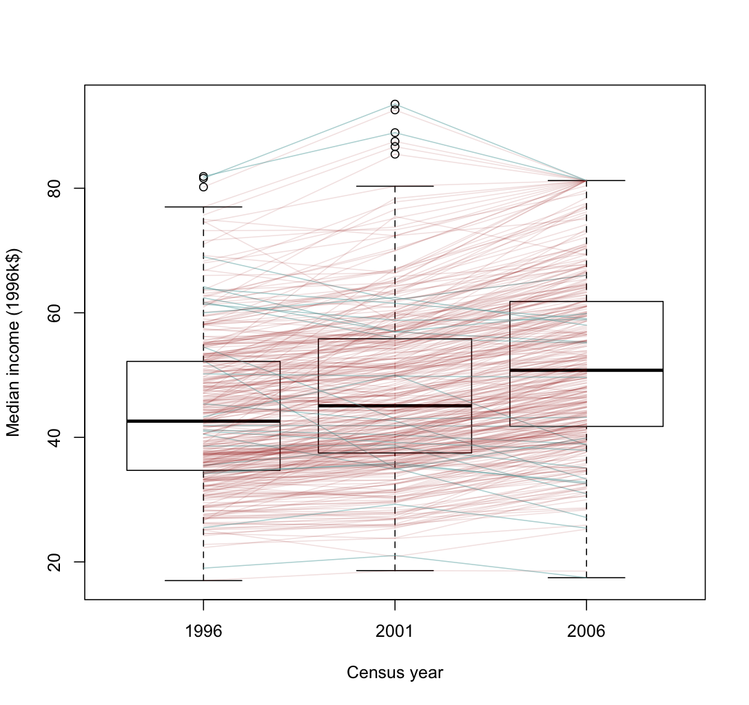
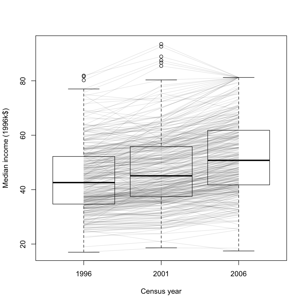
I think this graph is an improvement over the density plot from StatsNZ I showed earlier.  It’s a box plot of median income for all census meshblocks in the Auckland region, in 1996, 2001, and 2006 (except for the ones that were too small to have data released publically). The data are from Stats New Zealand, rescaled to 1996 dollars

It’s clear from this graph that most areas had an increase in median income, but that the increase was larger in wealthier areas.   A few areas went up sharply, then down again, presumably in the dotcom crash.  Some of the larger decreases are probably due to changes in housing mix: two meshblocks in Auckland Central have declined a lot, and I expect that’s due to more small apartments.

It’s also worth noting that the percentage increase in median income is much closer to being constant across meshblocks.  In that sense the increase in inequality is not as bad as in the US, where increases in GDP have almost entirely ended up with the rich.


[Update: here’s a version where the areas that decreased from 1996 to 2006 are in a different color.  I don’t know if it helps for seeing the overall pattern.  Given more time and if WordPress took SVG, it would be possible to have mouseover labels for the meshblocks so you could see which is which.]